


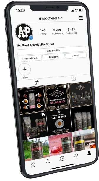
2021 became a year of revival not only for people but also for brands. Many companies have closed, others in reverse. One of those who was not afraid of a challenge, was American company The Great Atlantic & Pacific Tea Co., also known as A&P.
This brand has existed for 156 years (1859-2015) and at one time was more popular than McDonald's and Google. At its height of popularity, the company had 16,000 stores across America.
Our client decided that 2021 is the time to revive the brand and asked us to bring back the vintage history of the company. Remind customers of the good old traditions of A&P coffee and tea.
Logo timeline
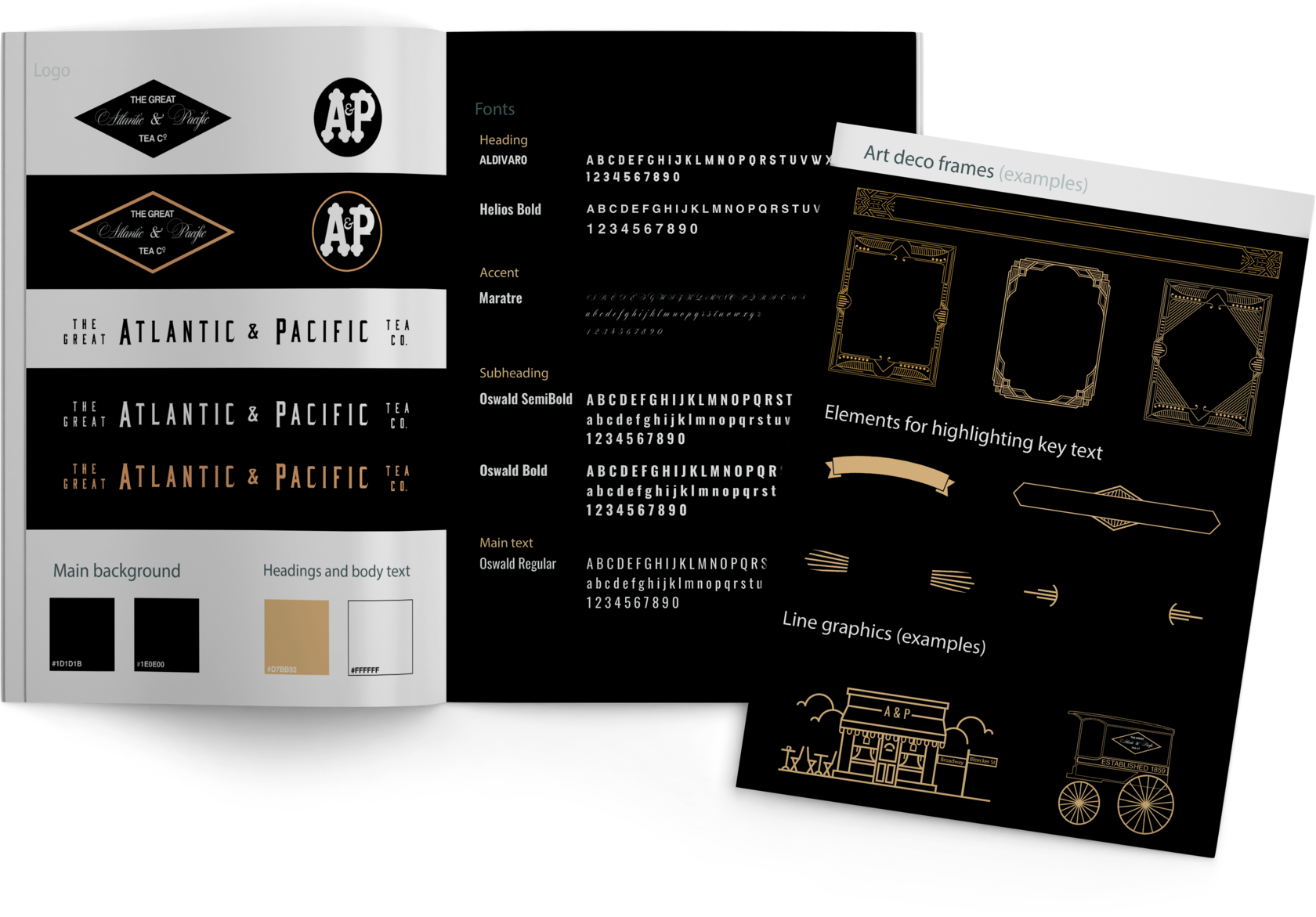
Although A&P was a company with a very rich history, the style and color palette of the retailer's logo were set at the outset, and by the end of its existence, the vast network maintained a simple and clean approach to design.
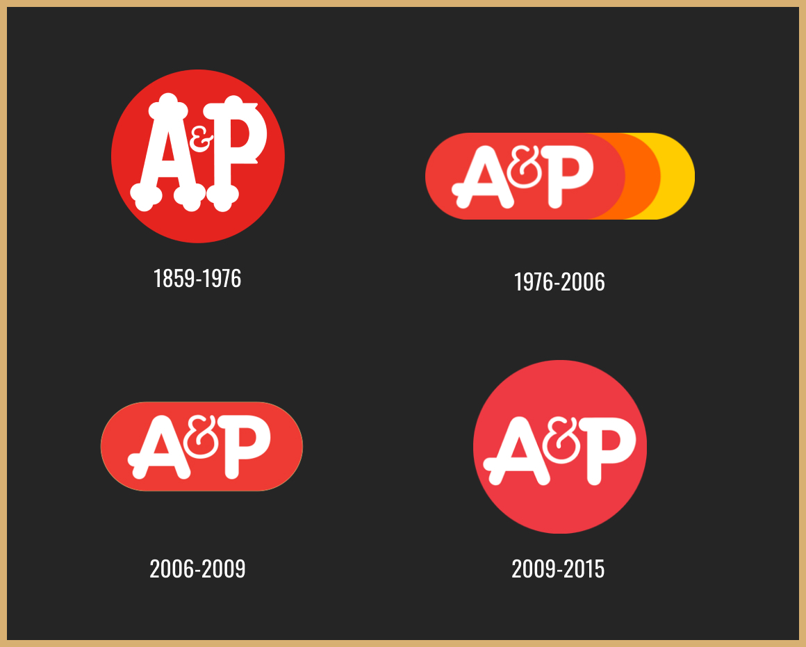
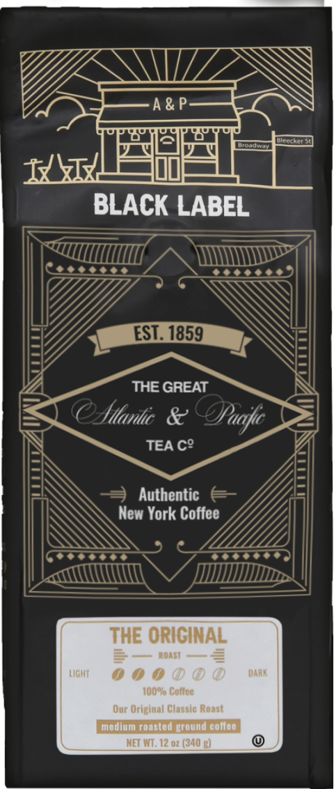
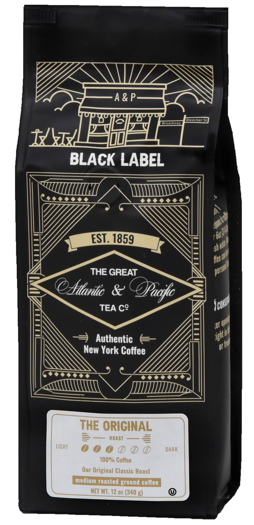
The original A&P logo was created in 1859 - a red circle with a white monogram. The ampersand is made of thin smooth lines and placed between the upper parts of "A" and "P", being small and delicate. This logo but in black and white color we recreated in the brand's new vintage history.
The last redesign of the brand was in 2009. The company decided to return to the original round logo shape, replacing the oval with a bright solid red circle. This was the last logo of a huge respected American company until 2015.
Brand history behind the package
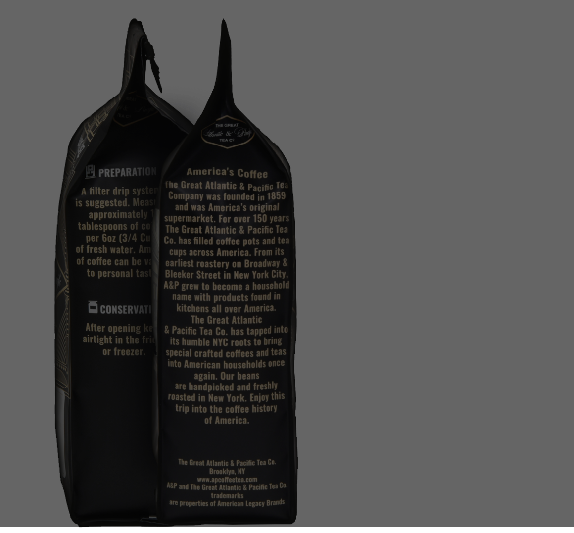
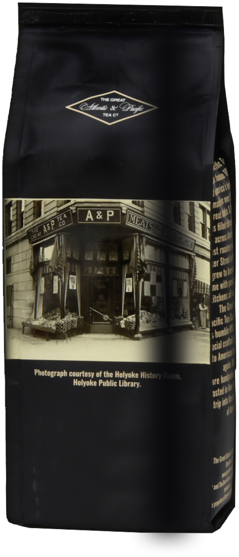
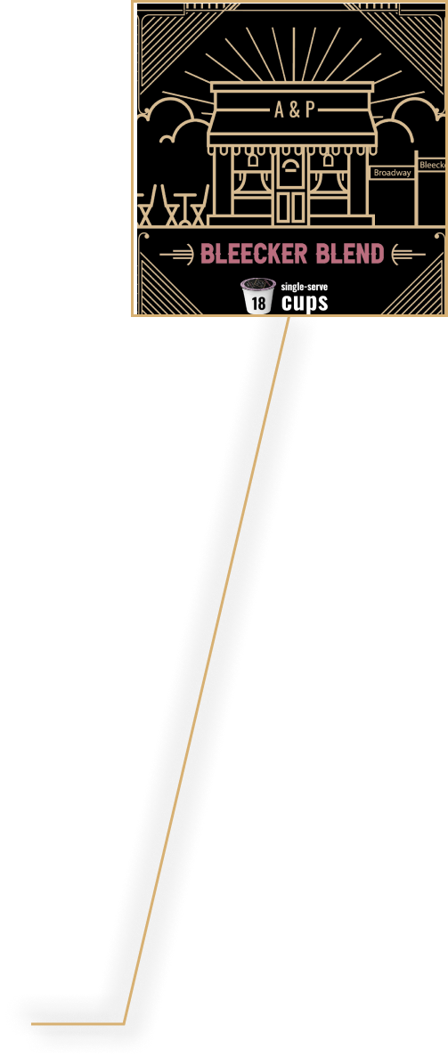
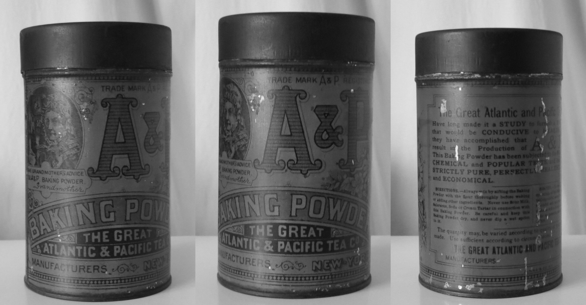
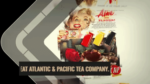
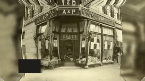
After recreating the historic circle and rhombus shapes of the logo, we started working on the packaging design for coffee and tea. When creating the concepts, we drew inspiration from vintage photos of A&P stores on Broadway and Bleeker Street in New York. This is where coffee used to be roasted, and then made its way into kitchens all over the country for people to enjoy its exquisite taste.
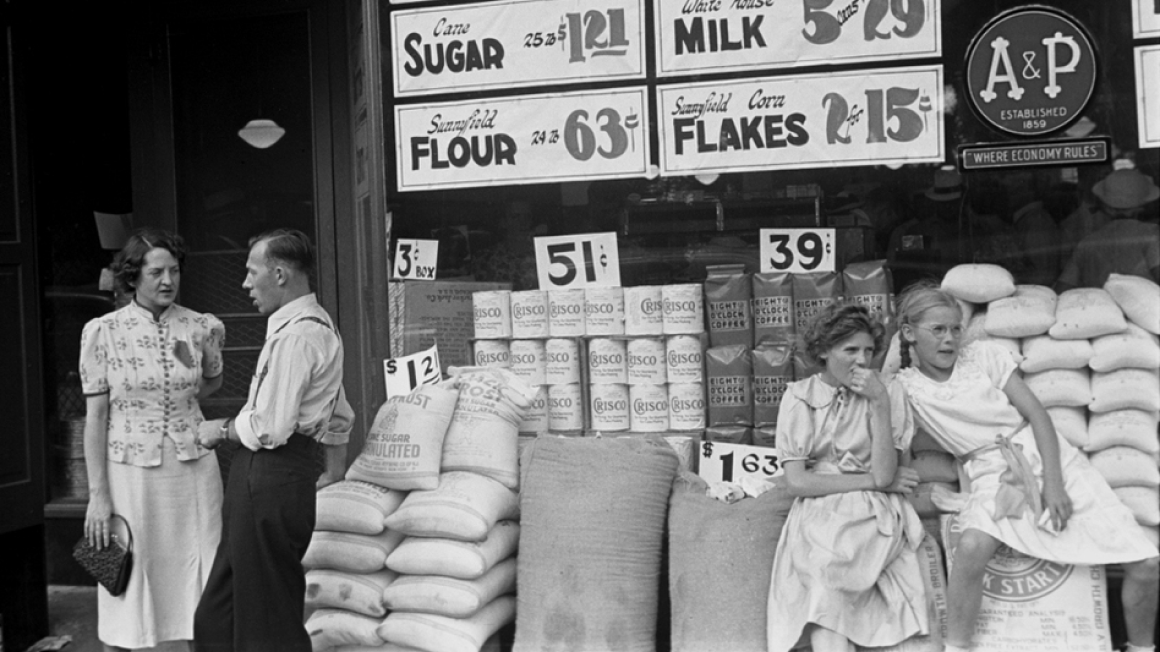
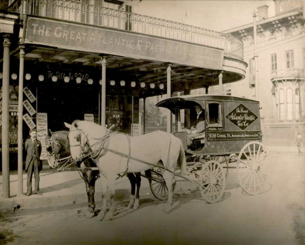
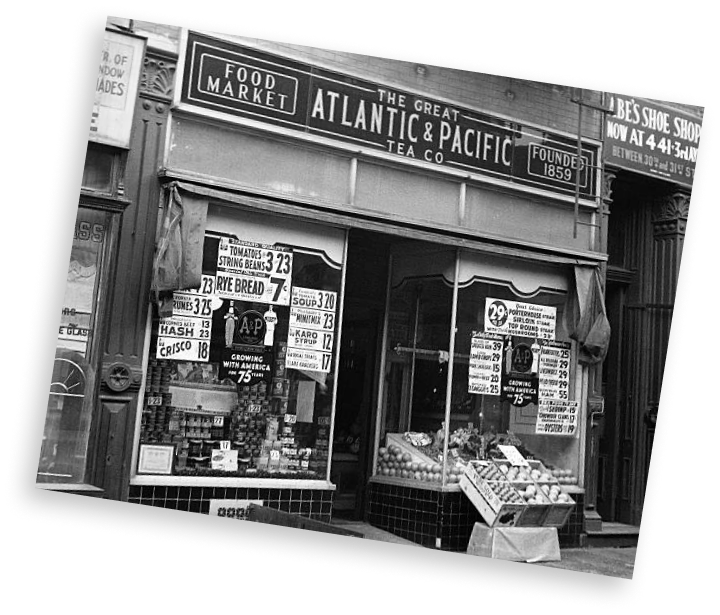
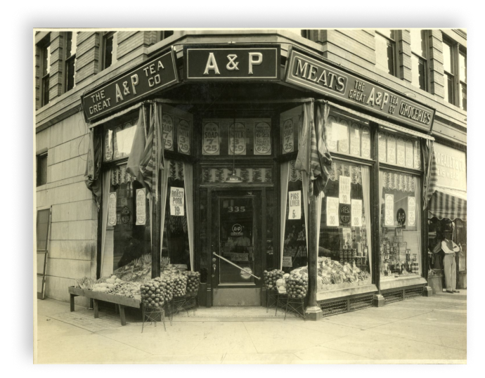
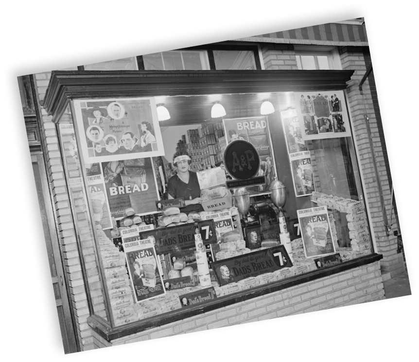
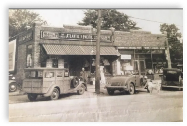
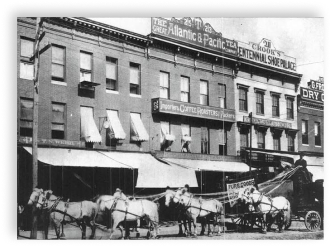
Many elements were taken from these photos and incorporated into the brand guideline: the carriage, the illustration of the store, signage, and the art deco frames. When choosing fonts, we followed the style and overall mood of the era. We selected several fonts with elongated and handwritten letters, which became the basis of the whole identity.
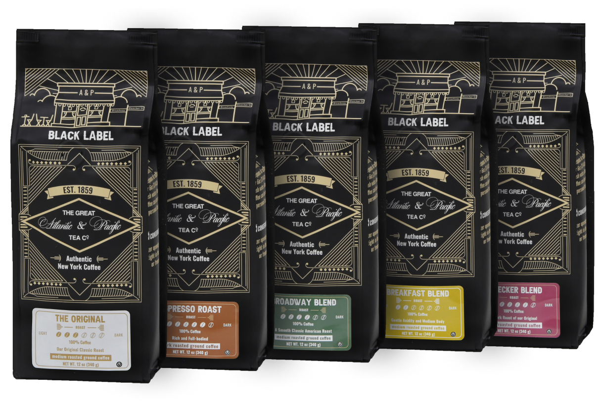
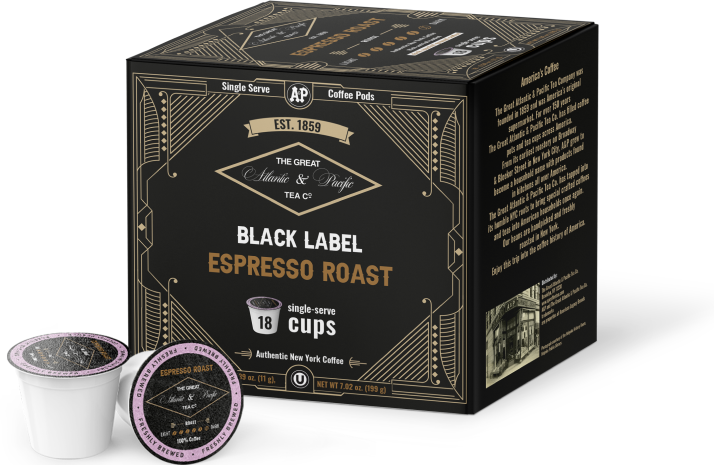
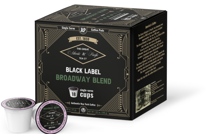
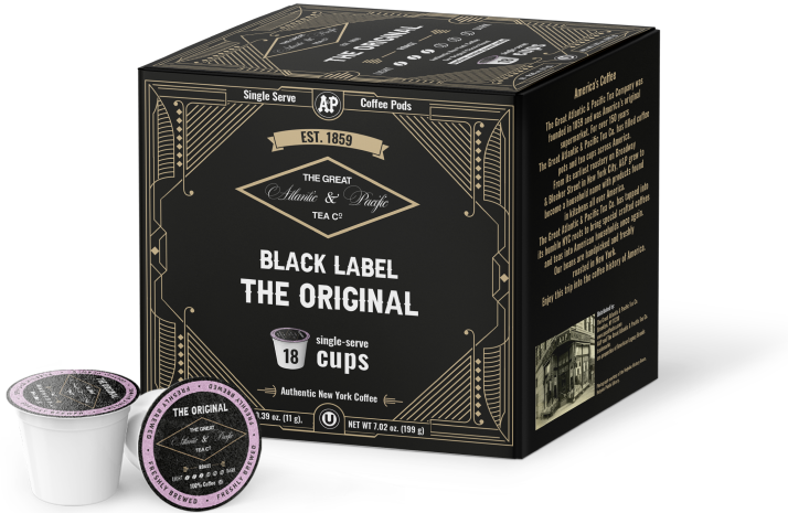
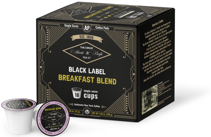
Then we started working on the Black Label coffee line. When creating its visual style, we drew inspiration from a vintage A&P design and transformed it into a modern version. Based on the guidelines and brand's previous coffee packaging, we created this identity for the coffee line.

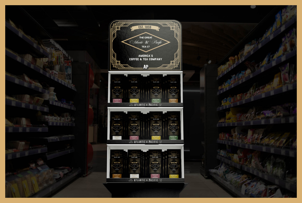
After approving the final design of the Black Label coffee, we developed a POS display, which the client plans to install in stores.
Along with the ground coffee, A&P produces packages with 18 single serve pods. For these packages we created a design, where each side has its own meaning: the brand history, instructions, and visual awareness.
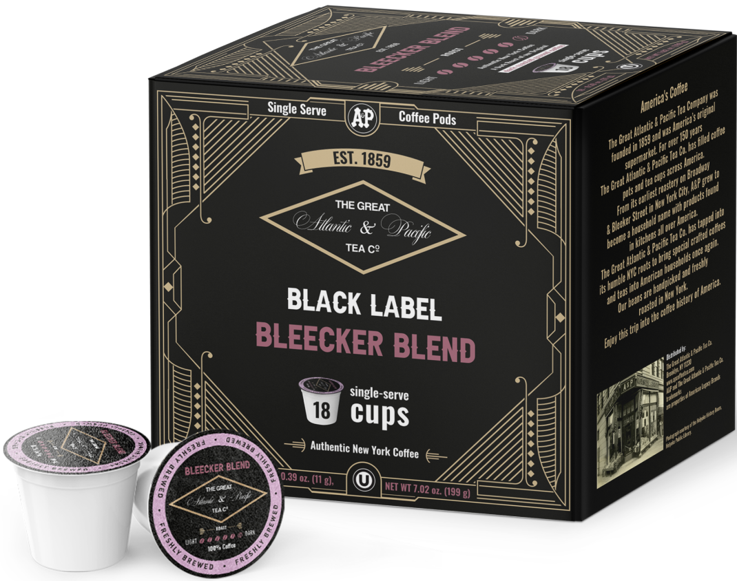
Logo
Back side
Instructions
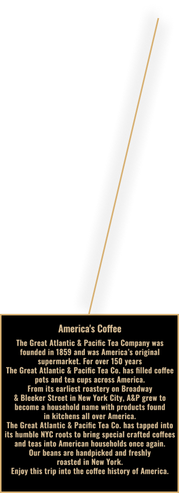
History of company


For better recognizability of your favorite type of coffee, we chose different colors, each corresponding to its name.
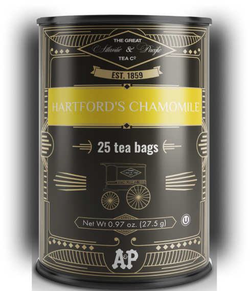
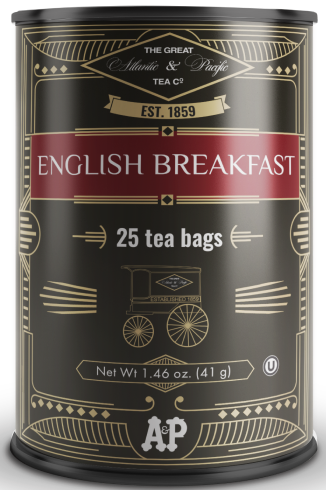
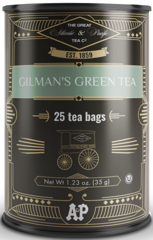
And then followed the tea. Same as with the coffee, we were inspired by the previous A&P tea package, their vintage style and mood, adding a tiny modern touch to this mix.
The art deco frames, the carriage, the logo, the brand's legendary founding date - all these are the brand identity of the new A&P tea design.


Only the background color, matching its name, remains different.

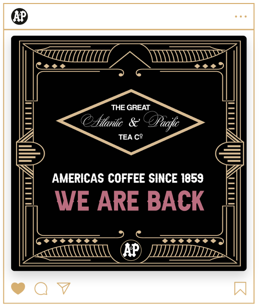
We are back.
brand identity
in online and offline advertising
brand identity
in online and offline advertising
A quality product requires no less quality of online and offline advertising promotion. We also helped the brand with this. We developed a corporate identity for the visual presentation of the website, taking into account colors, fonts and graphic elements. We also made banners for the Instagram feed and website.
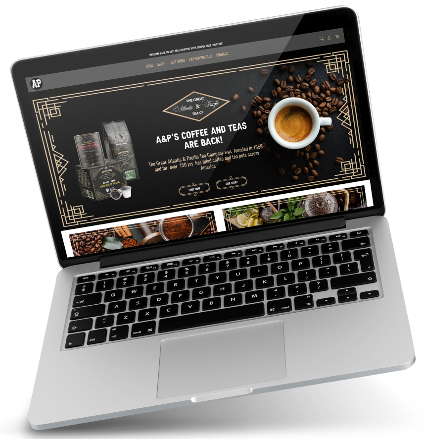
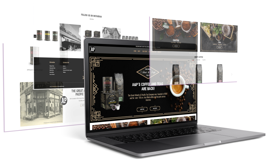

In addition to that, we created promotional videos for social media and YouTube. The main elements here were the vintage photos of the brand which we brought to life in the video. Because of this, the video came out attractive and more effective than we would make it with static images.
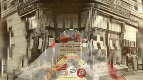
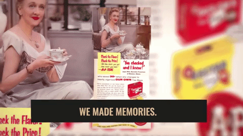

The main message in the new brand positioning is the "We are back" phrase. It appears everywhere: on billboard ads, signs on the buildings and stores and merchandise as well.

Previous Example / Next Example
WE ARE BACK
WE ARE BACK
WE ARE BACK
WE ARE BACK
WE ARE BACK
WE ARE BACK
WE ARE BACK
The client is targeting the American mass-market in the first place, as well as Canada. Major outlets are planned to be in New York, Los Angeles, California, New Jersey and Ohio.
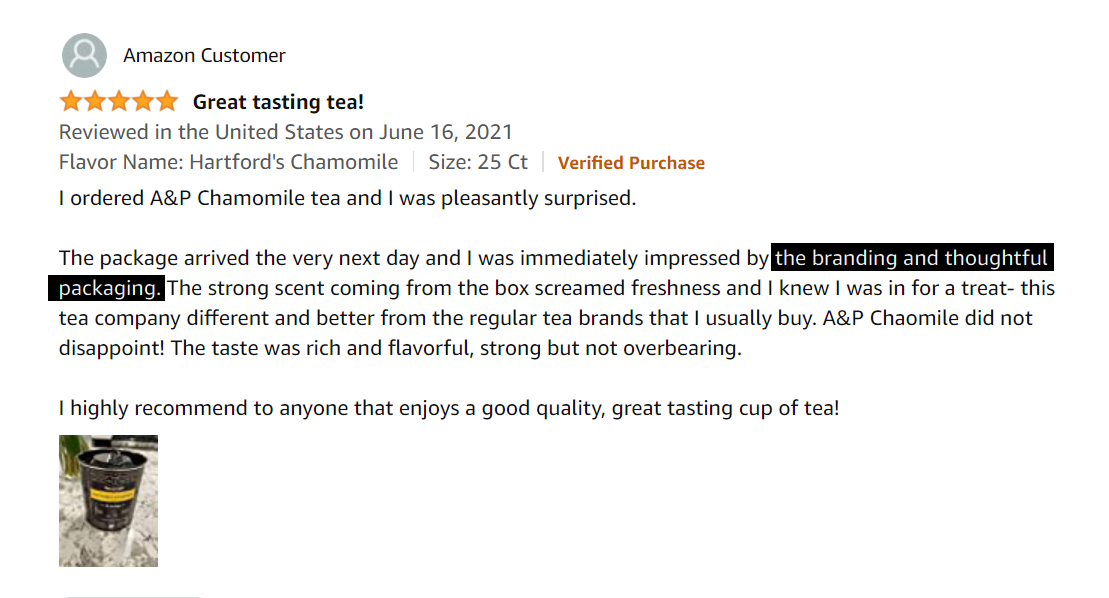
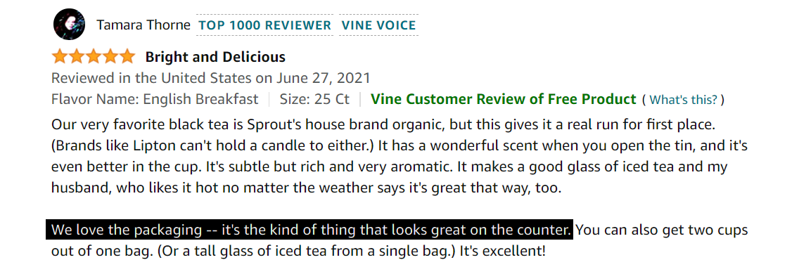
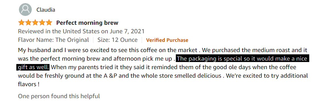
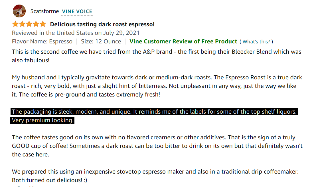
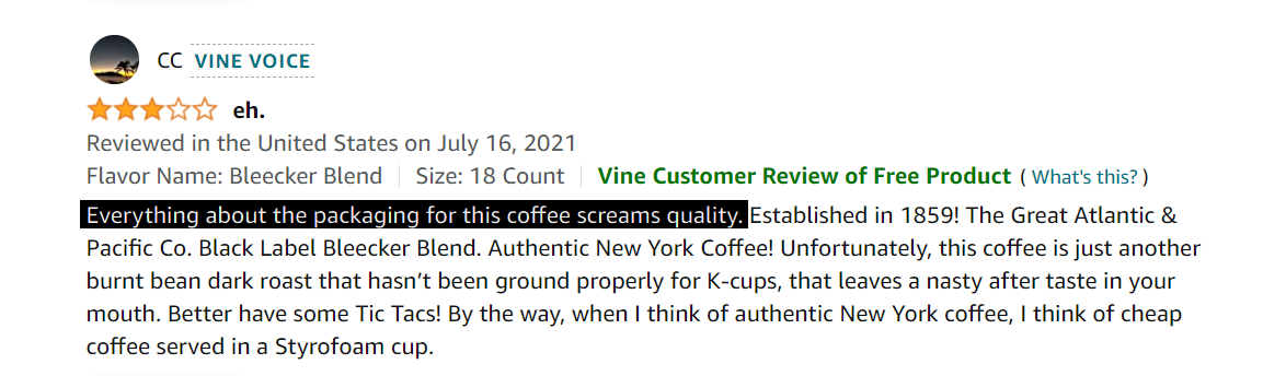
The sales of A&P products on Amazon have already started. The company is getting dozens of positive reviews about the taste of the coffee and tea, and we're enjoying customers' feedback about the visual style of the packages. We suggest you do the same with us!

It's always worth coming back if you are expected.
nome team
Myroslav Gret — art director
Eugene Leshtakov — videomaker
Kate Yurkiv — coordinator
Julia Sanina — middle designer
Kate Gret — Business analyst
Mary Tymoshenko — UX/UI designer
A&P
David Haddad — client
Start to work
hi@nome.agency
Write us to messenger


