


PhoneRag — a brand
with an unobvious truth
with an unobvious truth
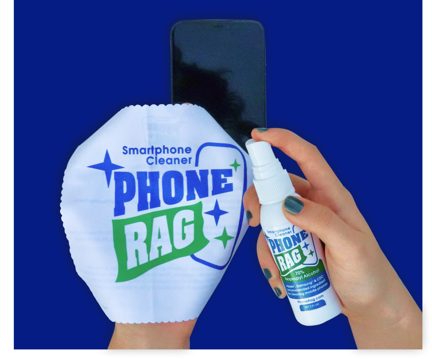
Did you know? Phones carry over 25,000 bacteria per square inch. The same space on a dog bowl carries only 2,110 and a doorknob only 8,643 .
We didn't think about the problem's scale before, but after getting acquainted with the brand's positioning, we began monitoring the cleanliness of our smartphones more thoroughly.
So, what our clients offer to solve the problem and how we assisted them with marketing the product - see below.
We didn't think about the problem's scale before, but after getting acquainted with the brand's positioning, we began monitoring the cleanliness of our smartphones more thoroughly.
So, what our clients offer to solve the problem and how we assisted them with marketing the product - see below.
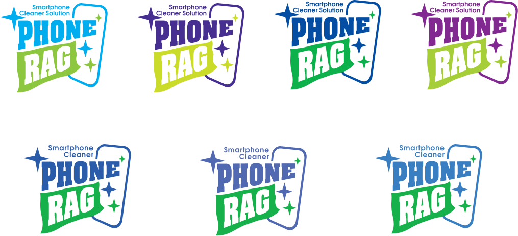
A logo that is recognizable among competition
Now in more detail. PhoneRag is a brand of one product: a set of disinfectant spray and a microfiber cloth.
The concept itself is not new, and during the brand development the clients already had competitors. That's why the priority was to stand out and subconsciously be remembered by a potential buyer.
The clients had a clear vision of what they wanted to give up, and what absolutely had to be present in the logo.
The idea. The clients wanted the logo to immediately transfer the message "keep your smartphone clean". That's why the logo had to include few visual elements — a smartphone screen, a name with a descriptor and a microfiber cloth.
In the final versions, we caught all the preferences and implemented them in brand identity.
Colors scheme. It should be associated with cleanliness, environmental friendliness and be different from competitors; some of them are presented below. Therefore, at the start, the clients abandoned red and yellow, preferring green and blue.
The logo was approved. It seemed that we coped with the main task, and then everything should go smoothly. Still, after that we encountered a more complex part of work when started creating label and packaging.
The main challenge was a huge amount of important technical information and product benefits that had to be laid out harmoniously and logically.
The main challenge was a huge amount of important technical information and product benefits that had to be laid out harmoniously and logically.
What about the bottle?
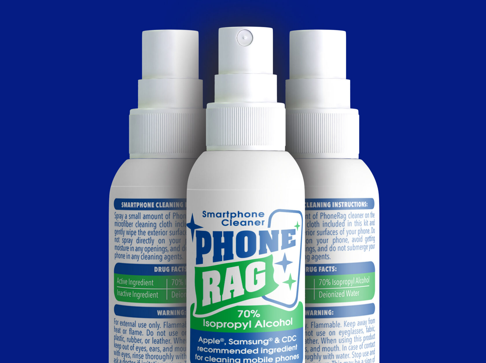
Almost done. Developed logo, label for the spray bottle, the finish was so close. But an important thing was ahead - the packaging in which the bottle with a microfiber cloth are stored.
Within this part we needed to take into account other challenges and important preferences from the clients.
Within this part we needed to take into account other challenges and important preferences from the clients.
Packaging was the last challenge
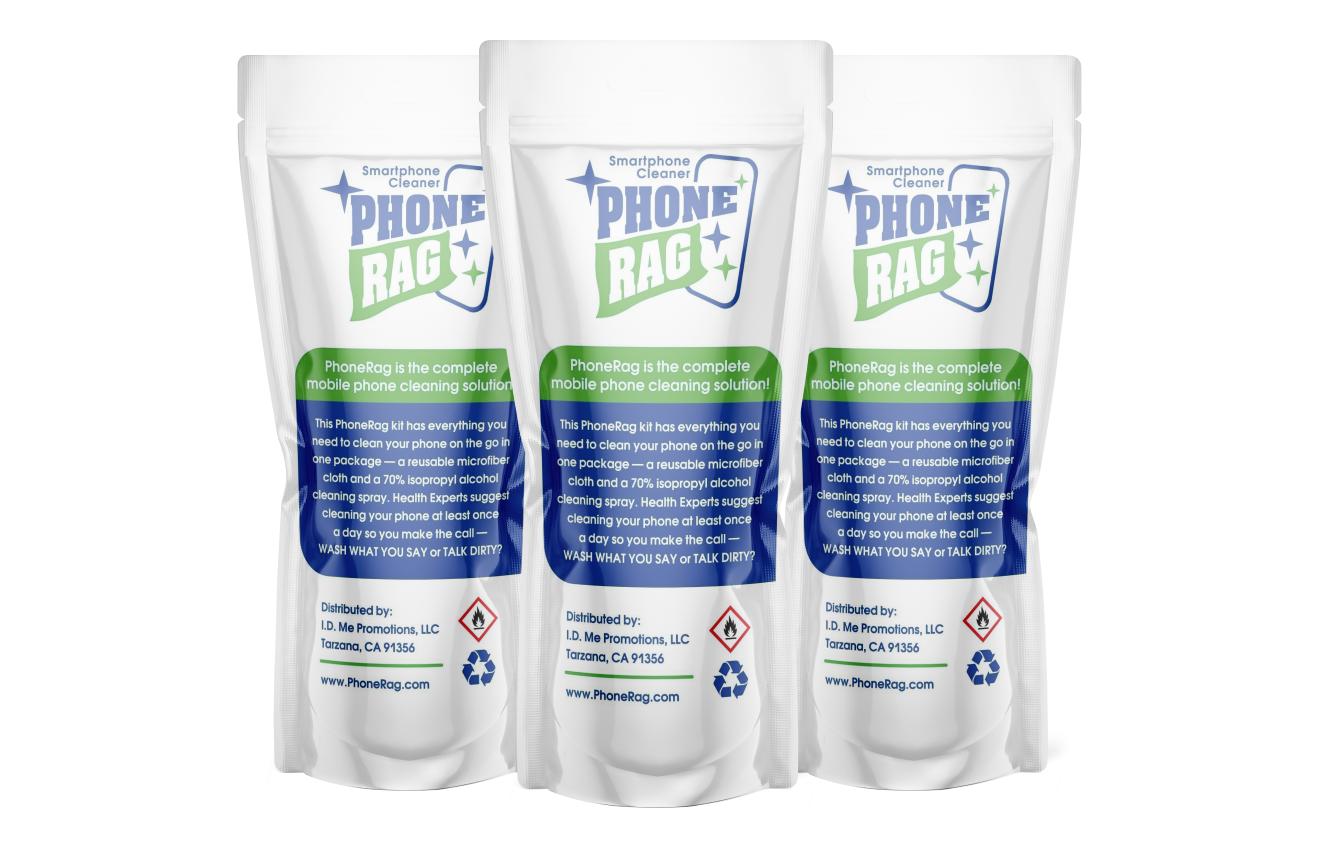
On the front side we duplicated information about the components, recommendations from well-known brands, as well as illustrated instructions of spray use.
The instruction later on appeared on the website, which both influences well on recognizability and is good for explanatory purposes: the product is applied not on the smartphone, but on the microfiber cloth itself.
The instruction later on appeared on the website, which both influences well on recognizability and is good for explanatory purposes: the product is applied not on the smartphone, but on the microfiber cloth itself.
At the customers' request, on the packaging front we laid out a transparent window, through which the product is clearly visible, taking into account the important information that is already visible on the label.
Information about the manufacturer and warning text with appropriate icons were placed on the back.
Information about the manufacturer and warning text with appropriate icons were placed on the back.
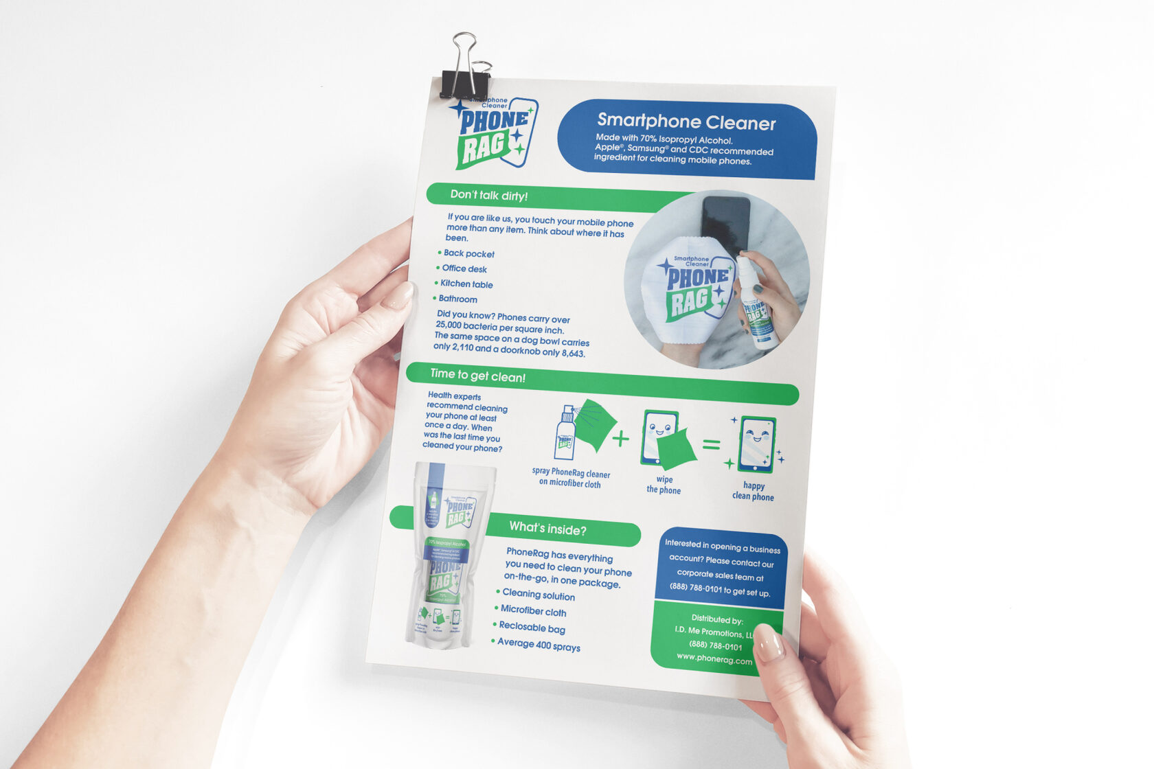
After the main work was done, the client ordered flyer design. It includes more detailed information for the buyer.
Flyer as the final point
We are ready to accept a challenge from your brand and implement the most daring preferences.
nome team
Kateryna Gret — team lead
Myroslav Gret — art director
Iryna Pavlovych — coordinator
Helen Dovzhenko — senior designer
Mary Tymoshenko — UX/UI designer
copywriter
Myroslav Gret — art director
Iryna Pavlovych — coordinator
Helen Dovzhenko — senior designer
Mary Tymoshenko — UX/UI designer
copywriter
PhoneRag
Neil Levitt and Jill Jacobs
— founders
— founders
Start to work
hi@nome.agency
Write us to messenger


