


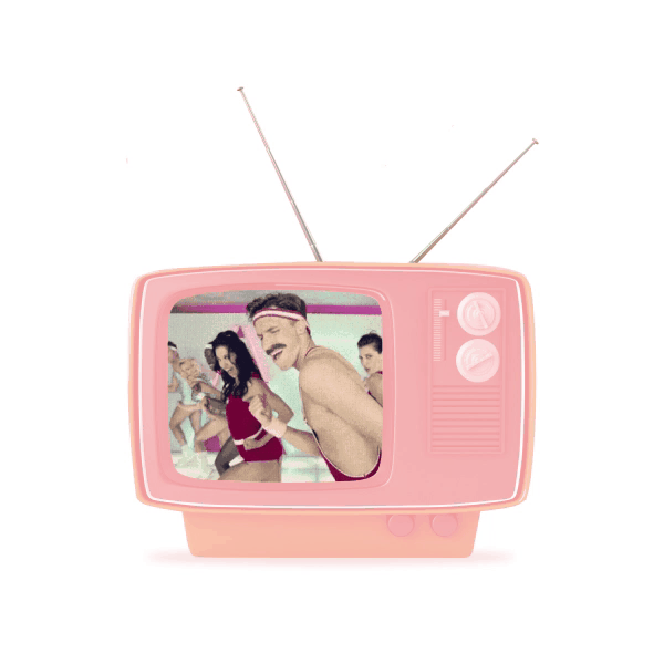
Have you ever thought that sometimes women's appearance can stop them from going exercising?
The inability to hide the flaws of the skin for many is a problem and a complex, one of the reasons not to go to the gym, where a lot of people look at you.
Now it's all in the past. Meet the innovative cosmetics brand Skin In Motion. Thanks to it you don't have to feel uncomfortable nor worry about the inconvenience of everyday cosmetics.
Particles of mascara won't be reflected under the eyes, and the foundation will not clog pores. Each product is designed to be used before, during or after exercise.


Gia, the founder of the brand, together with her team asked us to create labels and packaging for Skin In Motion products.
She had a clear vision of brand positioning and its mission. The client preferred pastel colors, but at the same time we had to avoid pale shades and reflect movement, lightness and dynamics. Therefore, we chose three colors, which indicate the three stages of application:
plum — before
light coral — during
burlywood — after
The aim of Skin In Motion is to allow you to exercise and look the way you want and we convey this message through graphic design.
Therefore, the style resonates with the 80s, which many associate with the peak of popularity of dance aerobics and bright clothes for classes.
Therefore, the style resonates with the 80s, which many associate with the peak of popularity of dance aerobics and bright clothes for classes.
Modern style of 80's
We were challenged to develop a design system that would adapt to different label and packaging sizes. It was necessary to keep the three branded strips so that all products follow the same style.
Also quite a difficult issue was the selection of colors. The colors that we demonstrated above had to be printed on different surfaces with various inks and different ways of application, which became a considerable challenge in communication with many printing agencies as we wanted to receive the particular shades for the stunning look.
All in all, we managed to achieve the desired result that satisfied the client and us.
Clear icons about the benefits of each product, which we placed on the labels and packaging, allow customers to quickly read the information they need and make the design even more attractive.
Eye catching accents
For us the ultimate quality criterion of the design was ease of perception and "navigation".
Let's take a look if we succeeded?
Let's take a look if we succeeded?
The first product we started working on was a cooling facial mist. This is a kind of alternative to moisturizer after training, which balances the natural pH.
The main challenge in the design was the different shapes of cosmetics primary packaging, so we had to keep this lightness in composition in all products, even in complex vertical narrowed bottle shapes.
The main challenge in the design was the different shapes of cosmetics primary packaging, so we had to keep this lightness in composition in all products, even in complex vertical narrowed bottle shapes.
Cool it mist!

The next product we developed for Skin In Motion is a tinted moisturiser that comes in four shades.
What did we want to draw the customer's attention to when first contacting the product?
To the benefits that are not available in the usual foundation.
What did we want to draw the customer's attention to when first contacting the product?
To the benefits that are not available in the usual foundation.
Work it tinted moisturiser:
4 shades
4 shades
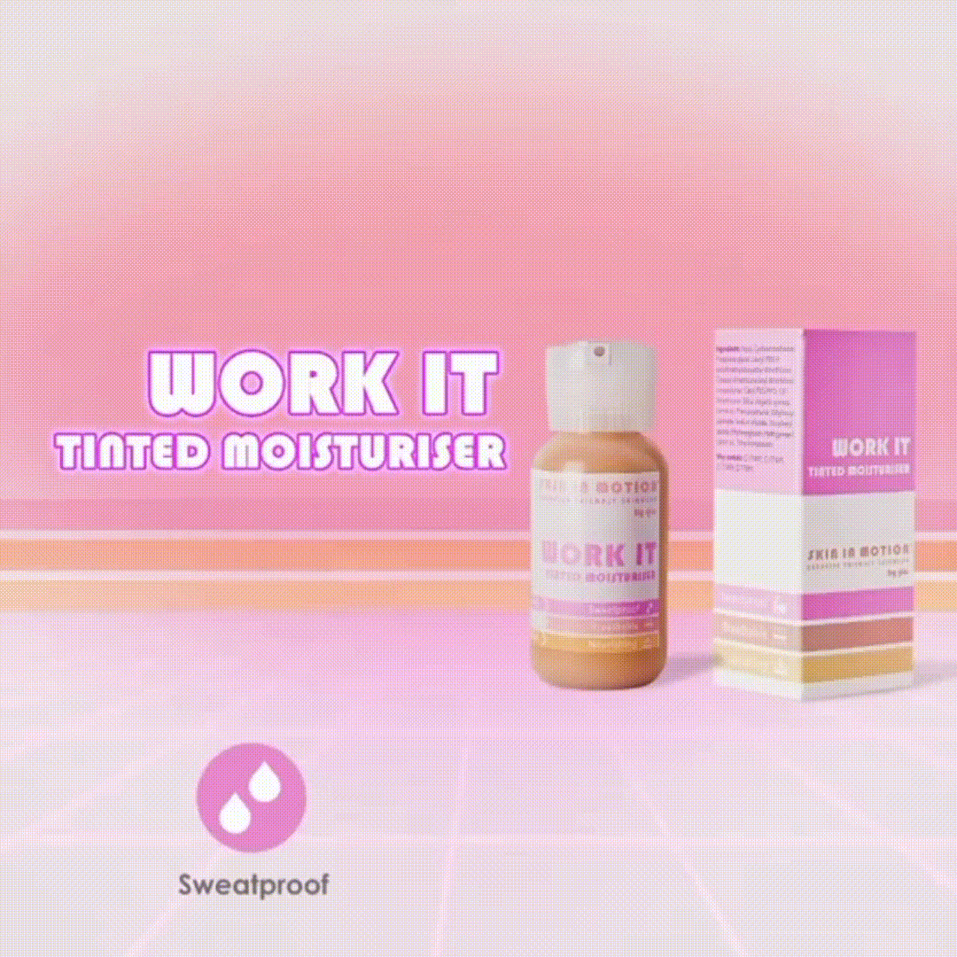
According to the client, this full coverage from Skin In Motion is formulated to keep pores clear, allows the skin to breathe, has sweatproof capabilities and hydrating properties.
All you need for a naturally radiant look. Our sporty beauties should know about these advantages.
All you need for a naturally radiant look. Our sporty beauties should know about these advantages.
Sweatproof, nourishing, creates a wonderful effect of false eyelashes.
Let's write it down on the package and emphasize these benefits in familiar branding style. Done.
The main thing to remember is that the label should not be cluttered and fit into one design system.
Let's write it down on the package and emphasize these benefits in familiar branding style. Done.
The main thing to remember is that the label should not be cluttered and fit into one design system.
Lift it waterproof
mascara
mascara
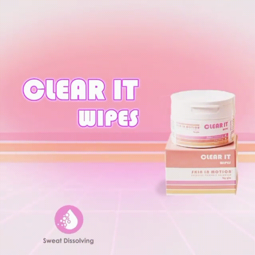
You exercise well, you sweat well.
Sweating is good for your skin but it's vital to cleanse once you're done so that sweat and dirt do not clog the pores.
And we managed not to "clog" the label too, although there was a lot of information for this product…
So we nailed it once again - did a balanced design following the general stylistics.
Clear it wipes
Well, what else can we tell you about the design? We've already shown the main points.
Thus, just enjoy the design of this great lip balm. And the tube is cool because it can be tied anywhere.
Thus, just enjoy the design of this great lip balm. And the tube is cool because it can be tied anywhere.
Plump it
tinted lipbalm
tinted lipbalm
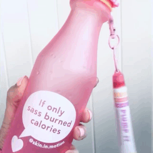
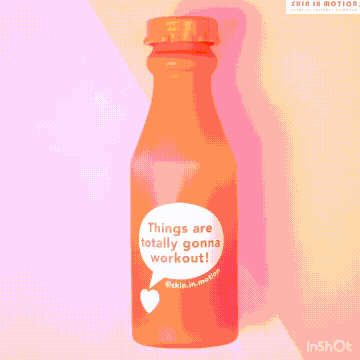
In addition to the main products, we also developed the design for accessories: a branded envelope and bottles with motivating wishes.
We kept the colors and the main style, diluting the catchy color of the bottles with white bubbles and motivating phrases on them.
We kept the colors and the main style, diluting the catchy color of the bottles with white bubbles and motivating phrases on them.
Motivators & accessories
nome team
Kateryna Gret — team lead
Myroslav Gret — art director
Kate Yurkiv — coordinator
Helen Dovzhenko — senior designer
Mary Tymoshenko — UX/UI designer
copywriter
Myroslav Gret — art director
Kate Yurkiv — coordinator
Helen Dovzhenko — senior designer
Mary Tymoshenko — UX/UI designer
copywriter
SKIN IN MOTION
Gia Mills — founder
Start to work
hi@nome.agency
Write us to messenger


