In 2018 we were approached by a client who sells food supplements under Jiva Botanicals brand. All startup products are based on Ayurvedic medicine and are positioned as the best in their market niche.

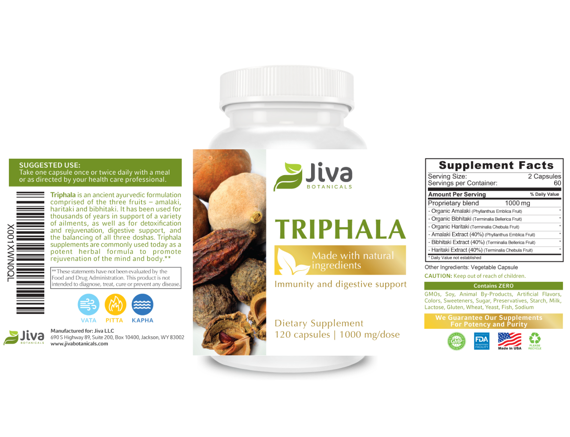
The client had a request: label design should meet the FDA standards that include sanitary standards for the quality of food and medicine. Our collaboration started with the design of Triphala label, a phyto preparation product for cleansing the body.
We were faced with the task of creating a premium and recognizable style that is inherent in Ayurvedic products niche. A balance that both meets client's needs and easily adapts design layout to future products - this was our aim.
We were faced with the task of creating a premium and recognizable style that is inherent in Ayurvedic products niche. A balance that both meets client's needs and easily adapts design layout to future products - this was our aim.
The first product.
Where did it all begin?
Where did it all begin?
The label of each product has clear priorities that guide the consumer's view:
On the front side:
1. Brand logo, which had to be fixed at the top to be recognizable as the brand is still new.
2. Each label has a unique visual hierarchy; as the product line has same design layout, it is important that the product name is easy to read
3. We offered several layout options, but stopped at the vertical one, as this layout allows showing the product well without taking up much space on the label and allows keeping the design system in other labels.
4. Additional elements that tell about the product type and its purpose, the number of capsules.
The main accents and general packaging style

The back of the label has no less important details - special icons.
Icons denote the basics of Ayurveda - the principle of 3 doshas (pitta, kapha, vata). These are life energies that regulate the work of both, the intellectual essence and the body. Doshas are the key factors in choosing a medicine.
The Ayurveda principles explain that Dosha anyhow determines the state and function of various organs and systems of the human body. It affects the intensity of energy conversion, synthesis and excretion of substances from the body. Guided by the meanings of these principles, we have developed icons that are easy to read by potential buyers.


Starting with one product, in 3 years we managed to develop for the client about 19 products, including adapters for small, medium and large product volumes.
The design system demonstrates good results, since we receive no design adjustments. Layout in 100% copes with the task of being universal for different formats.
The design system demonstrates good results, since we receive no design adjustments. Layout in 100% copes with the task of being universal for different formats.
Jiva Botanicals product line from 2018 to 2020


Previous Example / Next Example
2018
2018
2018
2018
2018
2018
2018
2018
2018
2018


Previous Example / Next Example
2019
2019
2019
2019
2019
2019
2019
2019
2019
2018


Previous Example / Next Example
2020
2020
2020
2020
2020
2020
2020
2020
2020
2018
We will develop a design system that works well on all your products


