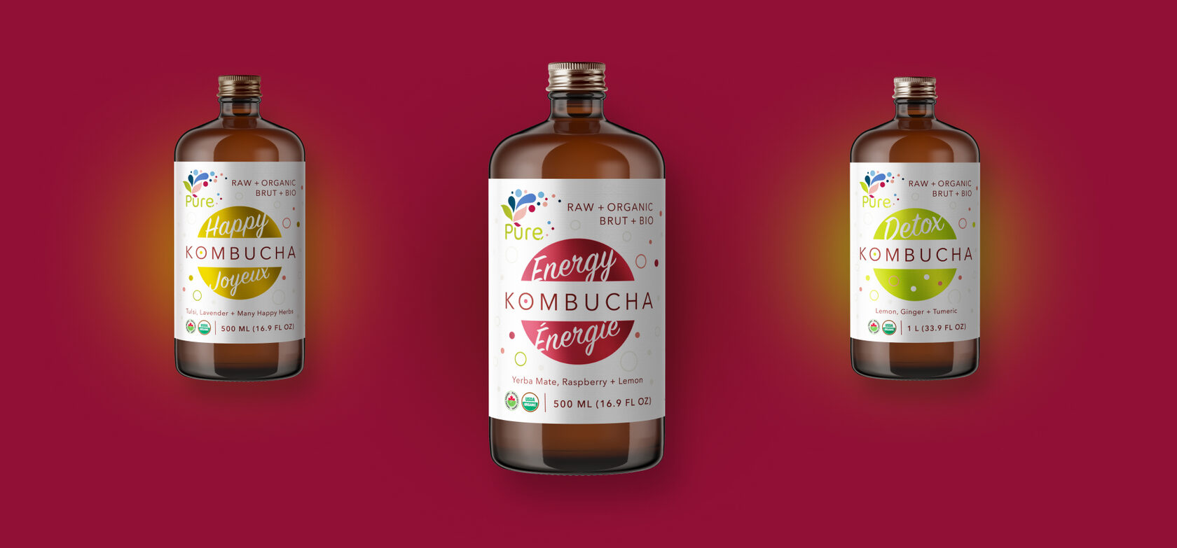
Pure+ is Canadian brand known for its certified organic products based on Kombucha. The owners wanted to create products safe to give their children and decided to return to the origins of creating drinks: use well known natural ingredients, which were used by people tens of generations ago. When they embodied the idea of creating really pure, healthy and useful products, they wanted the world to try Pure+

This was a rebranding project, as client provided old company branding and wanted a complete overhaul. We had to redesign logo so it would complement new company philosophy, as well as redesign old overcrowded labels for
13 products: 4 kombucha beverages, 5 water kefir flavours and 4 kombucha based balsamic vinegars
To emphasise pureness of the products, highlight kombucha and water kefir fermenting properties, we've decided to work on playful shapes, clean fonts and juicy color scheme, which reflect splash of energy and positive emotions after tasting Pure + organic beverages.
KOMBUCHA
Whether it is Kombucha or Water Kefir, design represents it clearly giving this way the customer quick understanding of what the kind of product is in hands
WATER KEFIR

KOMBUCHA VINEGARS
Another product line is for natural Kombucha Vinegars of Pure+ that can be used as dressing for salads and desserts, as a syrup for beverages. For each out of 5 flavors we've selected a new special colors scheme that highlights the vinegar's taste, and after that developed boxes designs that successfully complements the bottles
BLACK LABEL KOMBUCHA
And last but not least — redesign of an old product line named Standard Kombucha that became Black Label Kombucha. This product line stands out from Original Kombucha by its more saturated fruit flavors. The flavor is an accent here, rather than a healthy mix as in Original line. The client noticed that this product line with saturated flavors appeals more to men, that's why we were targeting this audience: bold black label designs with typical for men sophisticated style
Overall minimalistic direction reflects the simplicity and ancient origin of main products ingredients. Finally, with the new branding Pure + came to life and now is actively working on next sales quarter to make even more customers living happily and healthy!


Highlight the idea of your brand
values with us
values with us


