Protection isn't expensive, it's priceless
We were approached by a client from the Netherlands who sells high quality surgical face masks and respirators.
He tested different options and focused on the best products he could find. Earlier the client used packaging from the manufacturer, but at some point he decided to create his own consistent visual identity for the goods being sold
He tested different options and focused on the best products he could find. Earlier the client used packaging from the manufacturer, but at some point he decided to create his own consistent visual identity for the goods being sold

When creating packaging design concepts, we were guided by the wishes of the client, adjusting the overall style to the logo and website color scheme that the client already had created
Surgical face mask
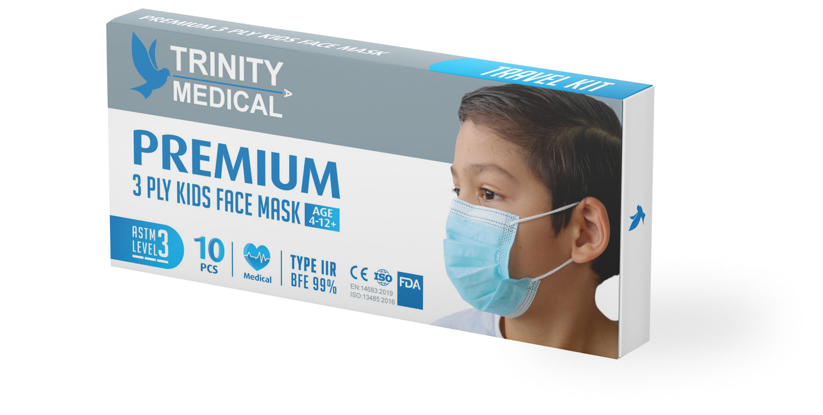
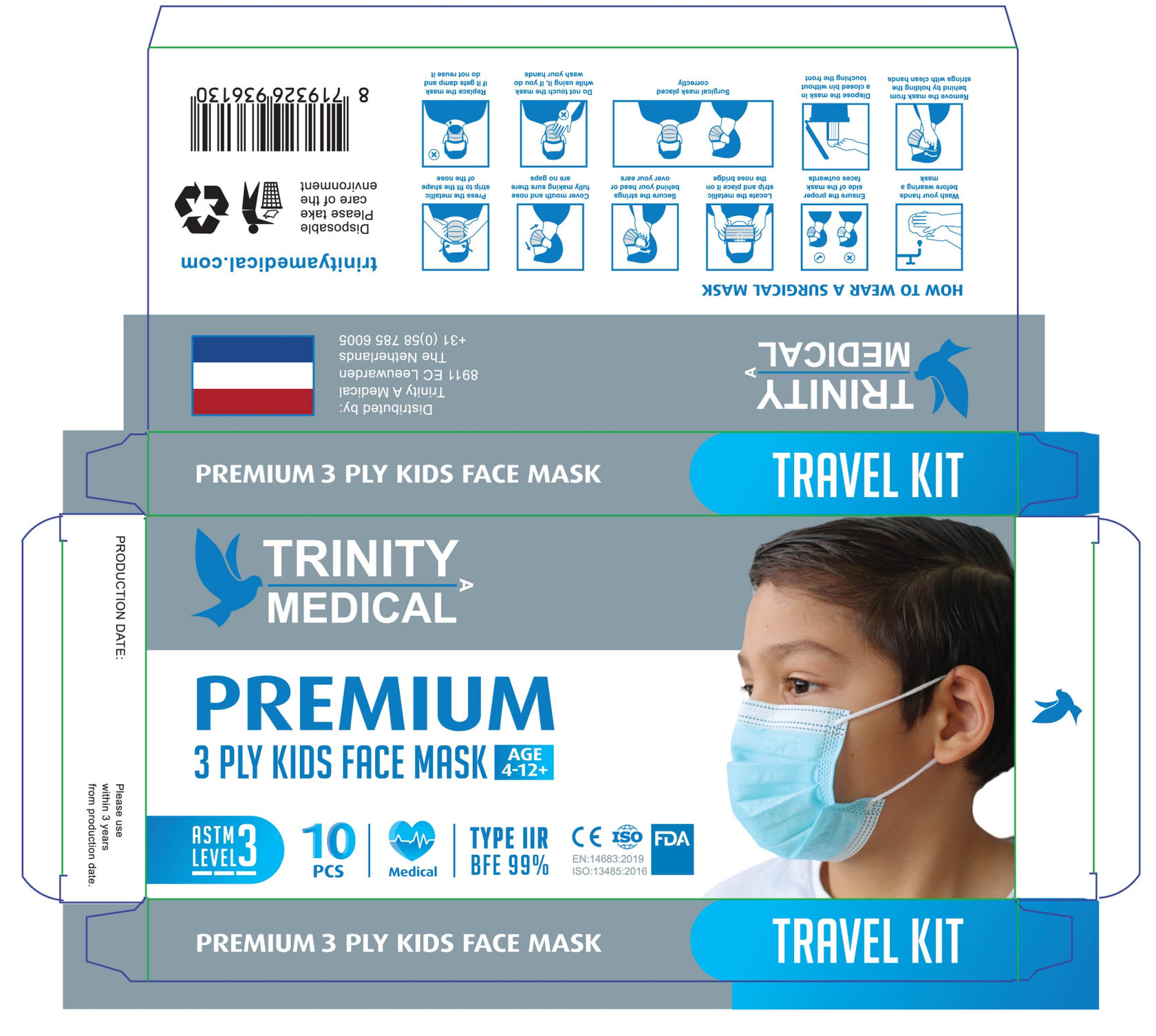
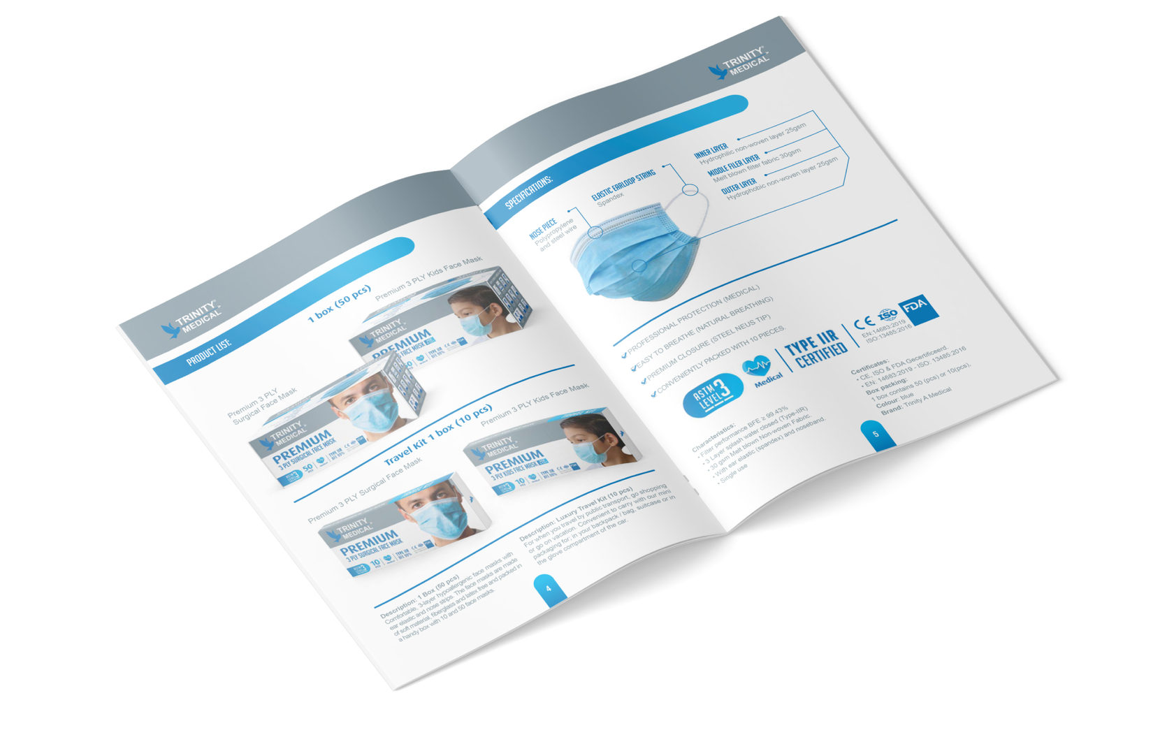
We started our work with the design of packaging for surgical face masks, for adults and children. The design had to be universal, without an emphasison the cultural features of a particular country, indicate high quality and convey a medical feeling, surgical sterility. What was done to achieve this? The predominance of white and light blue colors on the packaging with some gray background on which the logo is well readable
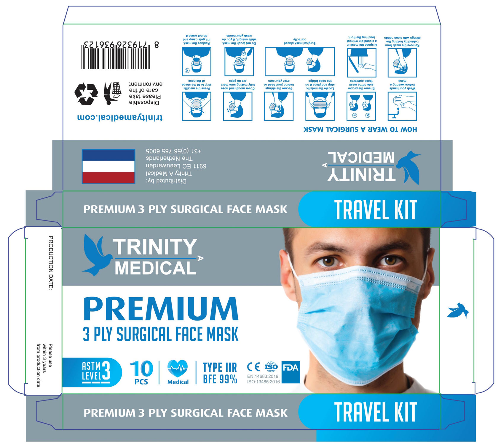
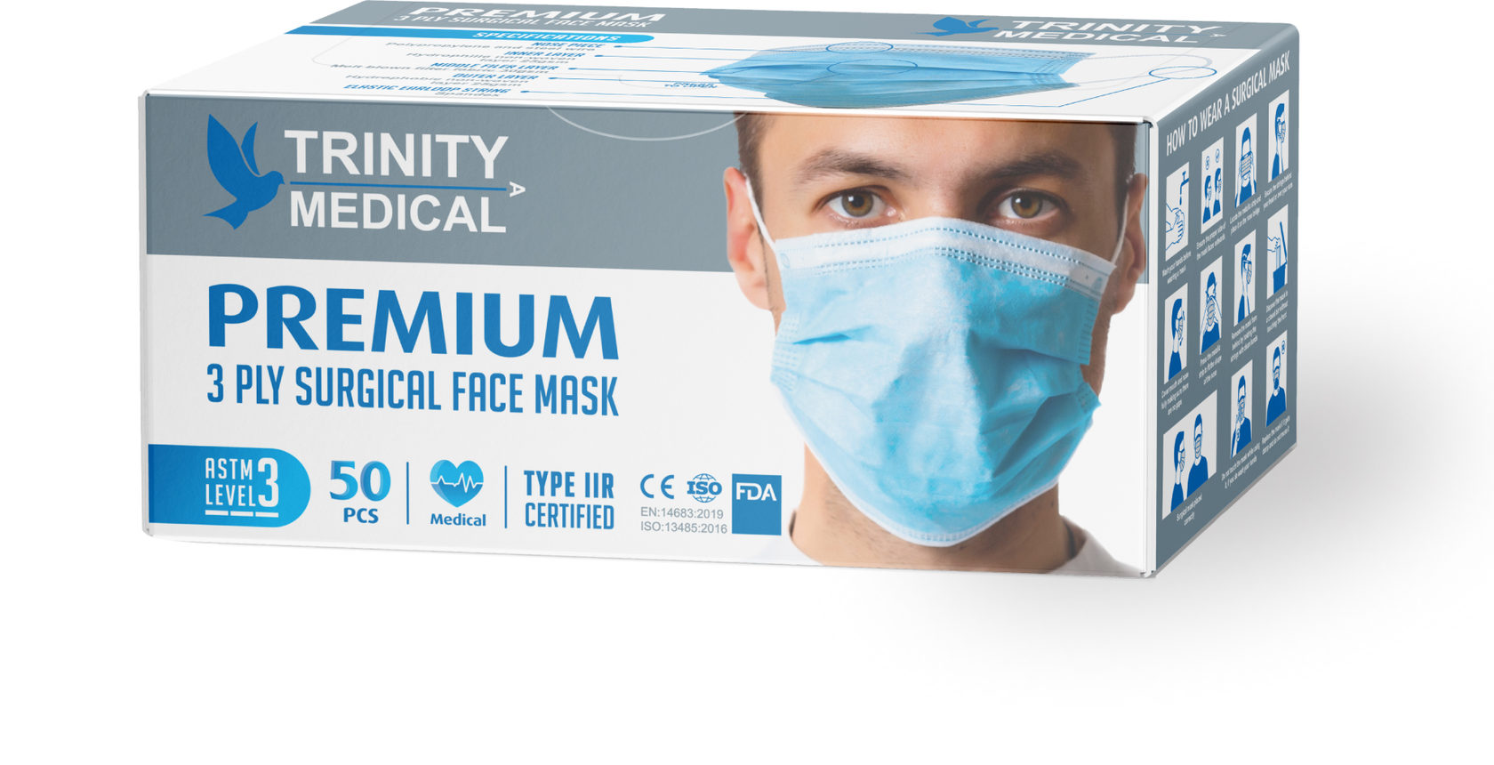
Based on the already created packages, we adjusted the design to smaller Travel Kit boxes, which are convenient to take on a trip.
KN-95 respirator
packaging
packaging
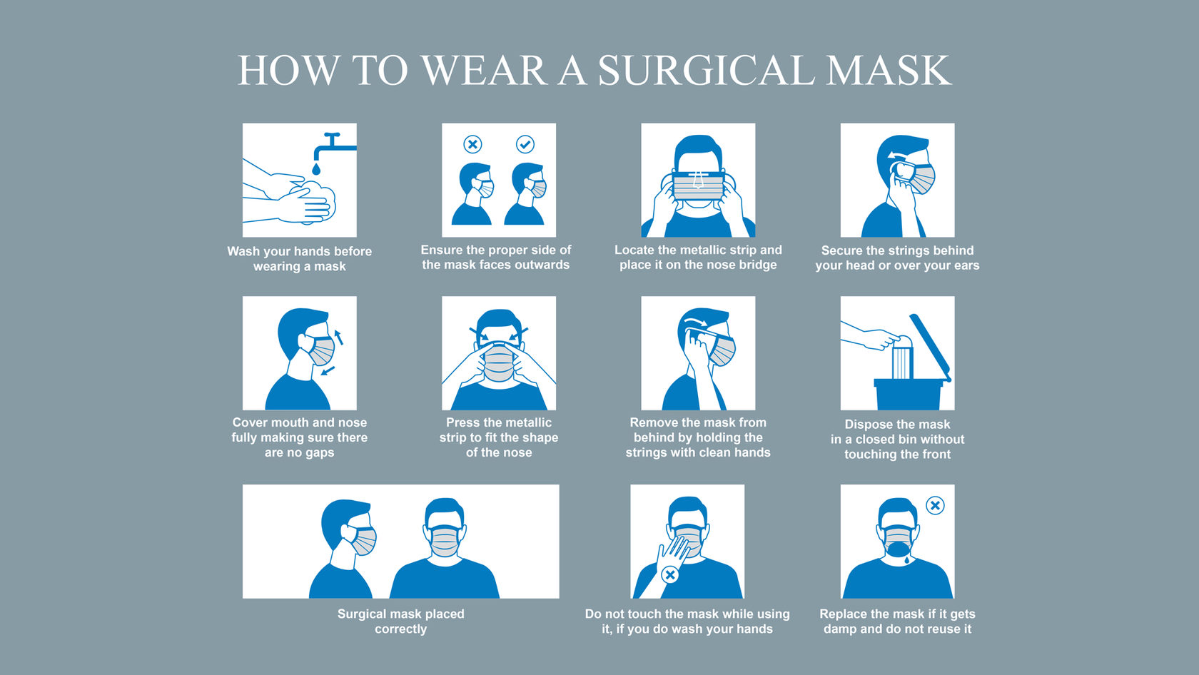
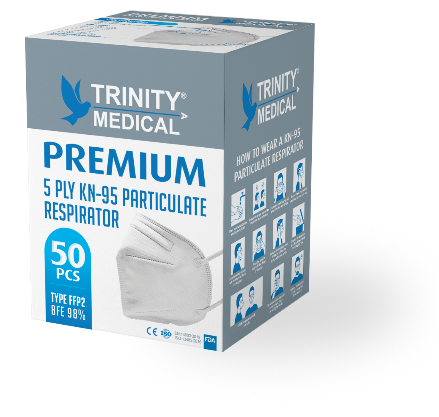
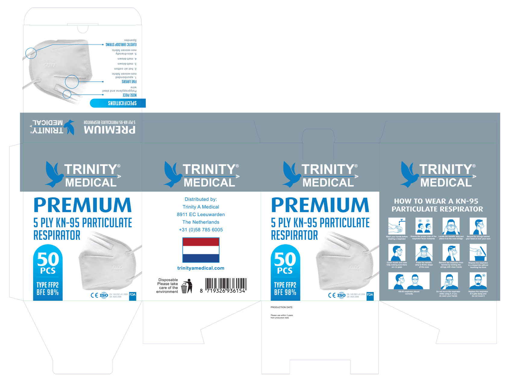
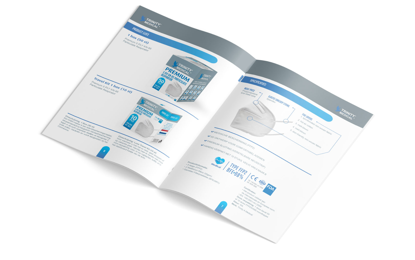
As the next step, we developed a packaging design for KN-95 respirator small and big packages. As in the first version, much attention was paid to the product, elements that indicate the high quality of materials and product benefits, as well as illustrated step-by-step instructions on how to properly wear and use the respirator.
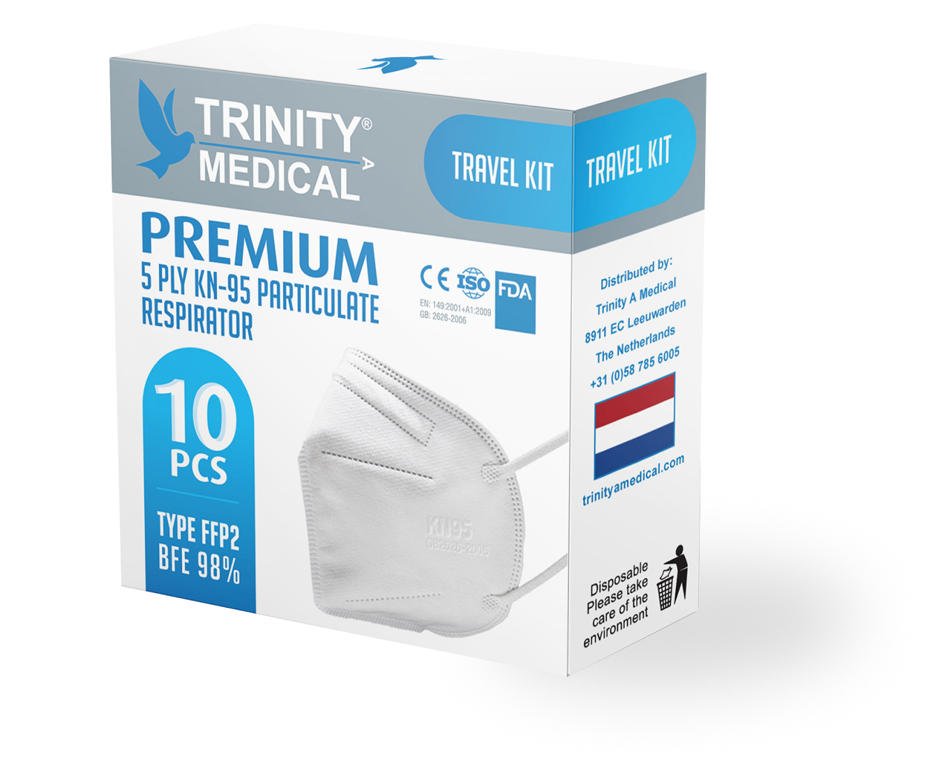
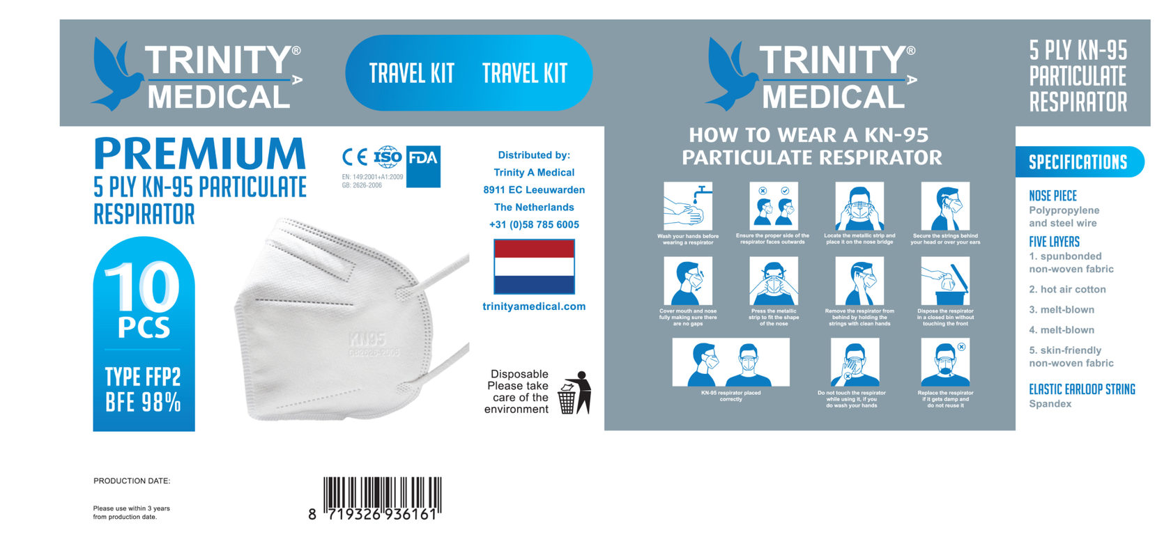
We placed the instructions on absolutely all packages, because our client pointed out that this is a problem. Even during a pandemic, not all people know how to wear protective masks
Brochure and roll up
banner
banner
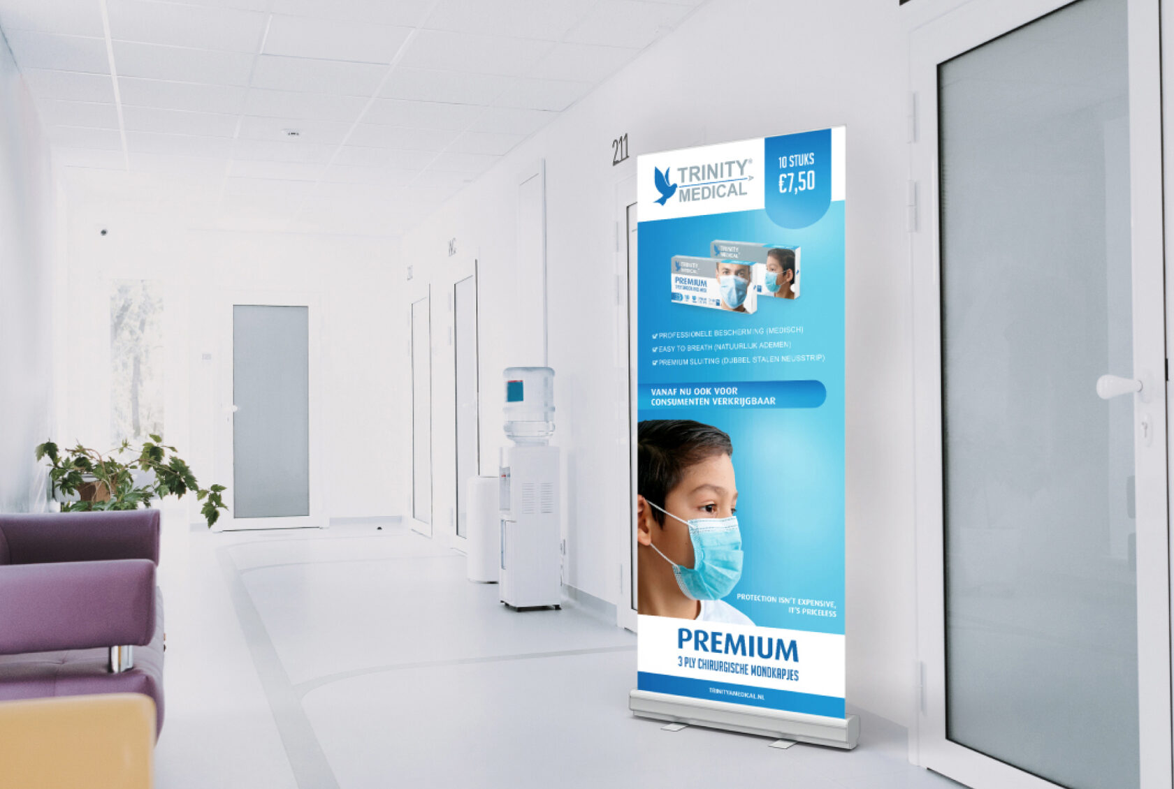
Apart from packaging, we developed a design for the roll-up banner, which the client would place mostly in hospitals.
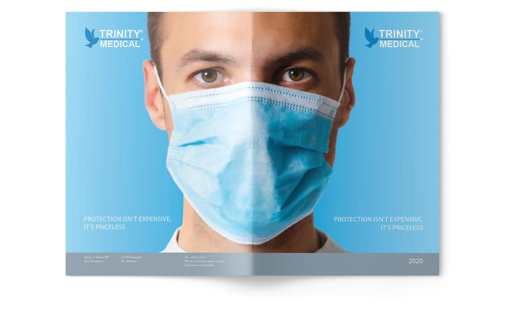
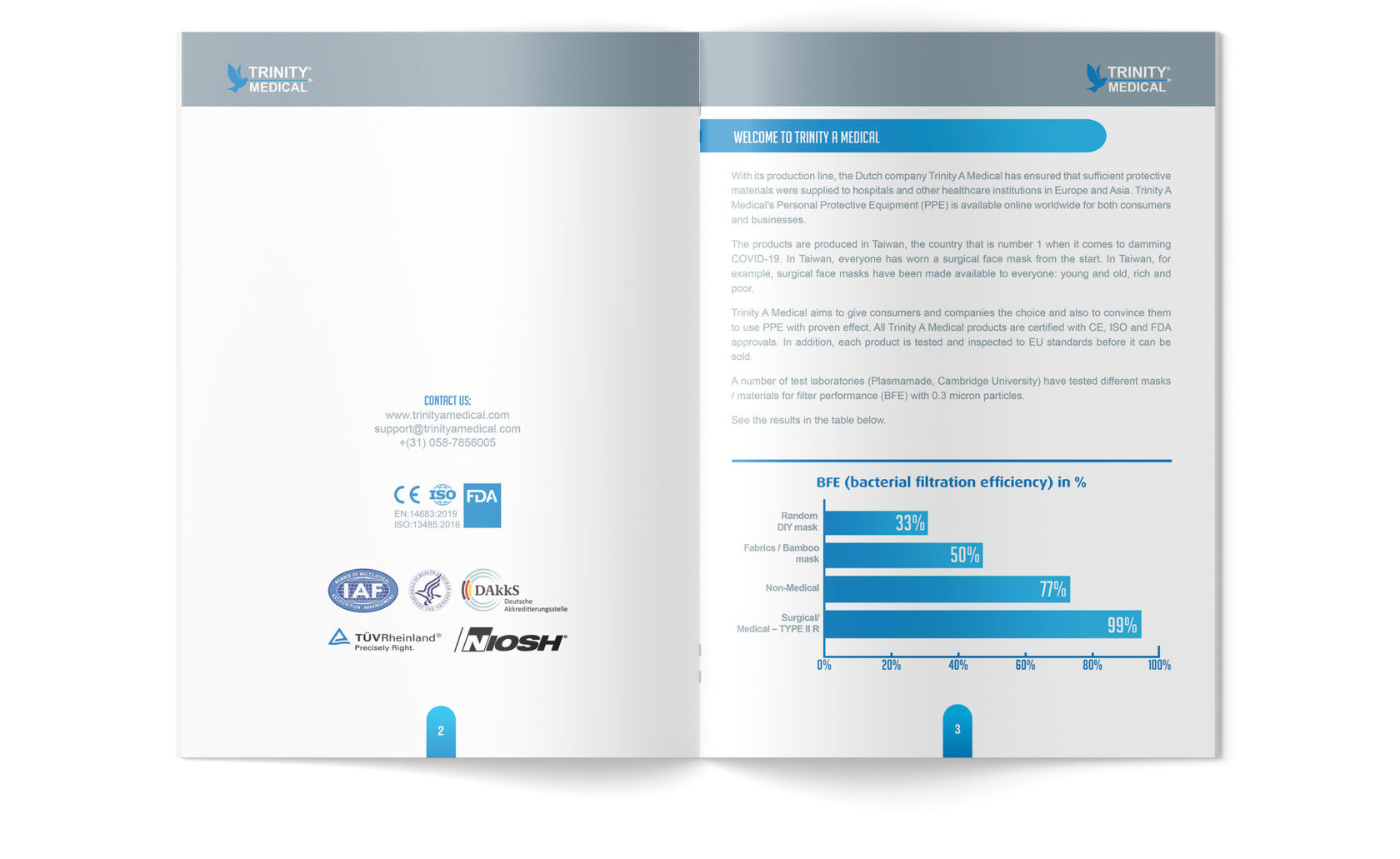
An A4 brochure and counter display box were also designed to advertise products offline.
Proper packaging design help to quickly make the right decision and protect against counterfeiting
